
The following is a blog entry I contributed to the Independent Sector’s NGen Blog on data and the non-profit sector.
Anyone poking around online newspapers has noticed a proliferation of info-graphics and maps. If these graphics are done well, they can tell a story much more quickly than a series of paragraphs.
Introducing data journalism – the newest form of online communication, and also a great way to get eyeballs on your website.
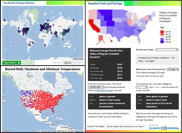
For much of 2011, I worked as a data journalist for Climate Central, where I attempted to tell stories about climate change and energy through both articles and data-driven graphics. For instance, during the Fukushima disaster in 2011, when people wanted to know more about nuclear power, we built this map to show the worldwide distribution of nuclear power. Or when we were experiencing record heat in July, we created this U.S. map. Another graphic and accompanying interactive fuel calculator shows gas prices around the country, and how much you could save by increasing the fuel efficiency of your vehicle. As we quickly learned, many web-surfers would rather point and click than read; such interactives were often our most popular content.
Climate Central has continued to embrace data journalism, and with great results. They recently created these detailed maps of sea level rise, which have been picked up by almost every major media organization and have flooded their website with traffic (and, not to mention, informed a lot of people about how sea level rise will affect their community).

The second lesson I learned is that while it is relatively easy to put data into a chart or onto a map, it’s much harder to tell a compelling story. You have to analyze the data and show the interesting bits. For instance, consider this graphic by the New York Times, showing Netflix rental preferences by zip code for major cities. The graphic shows an enormous amount of data, and it is tricky to know what you should look at. To help the reader, The Times added two links above the map, telling you which rental picks show the most interesting trends. The authors didn’t just put the data on the map – they looked for the interesting patterns and guided the reader to them. And while I’m proud of my above map of nuclear power, it doesn’t do a good job of telling the story that I wanted to tell – namely, that most countries stopped building nuclear power plants in the 1990s. A simpler graph, such as this one built by lswn.it, does a much better job of displaying that fact. It isn’t enough to put the data on a map or into a graphic; you also have to tell a story.
In short, data journalism offers a great opportunity to communicate a vast amount of information in exciting, interactive ways. But while the tools to do so are readily available, you still have to do the hard part – figure out the story, and tell it well.