Eastern Europe Bike Trip in Google Earth

I recently combined all of the GPS files from our ~1000-mile 26-day bike trip this past summer and uploaded them into Google Earth. The result is a path that you can “fly over” and follow. Google Earth also allowed me to plot an elevation profile of the trip.

Unsurprisingly, our favorite parts are almost exactly correlated with the hilliest sections–the Tatras mountains of Slovakia at the beginning of our journey, and the many mountains of Bosnia at the end.

You can download the KML file from our trip here and plot it yourself on Google Earth. I took a screen capture video of the route, which you can see below.

Posted in Uncategorized | Leave a comment

U.S. State Populations with Circles

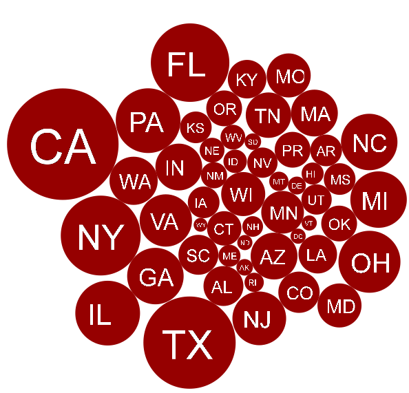
This weekend I taught myself how to use this javascript library MooCirclePack, which allows one to tightly arrange circles of various radii (yes, it was an exciting weekend). Below are the U.S. states, with the area of each circle proportional to the state’s population.

California is, of course, number one.

Moocirclepack only lets you put an image on each circle, and not text, so I had to use the Python pil library (which was a major pain to install) to turn the state abbreviations into images.

The most interesting thing I saw on this graphic is Puerto Rico (PR). Puerto Rico, with a population of 3.7 million, is more populous than 21 other states. It’s almost strange that it isn’t a state (based on population alone).

I do have some things I don’t like about this visualization. The spatial placement of the circles doesn’t mean anything (Oregon is next to Florida). Secondly, our eyes are not very good at comparing area. For instance, it’s hard to tell, by looking at this graphic, that California has a population 10 times that of Puerto Rico (38 million versus 3.7 million).

Posted in Uncategorized | 2 Comments

More Coal?

This following graphic comes courtesy of WRI, which shows where new coal power plants have been proposed. According to a new report by WRI, there are 1,199 planned around the globe, more than half of which will be built in India and China.

Posted in Maps | Leave a comment

Religion in America

A few weeks back I made the following map to show the religious population in each state, drawing on statistics from Pew Forum on Religion & Public Life. The data is from 2008.

A few things jump out at you: Evangelicals are concentrated in southern states; Catholics are found in the Northeast, North Central, and Southwest regions of the country; Mormons dominate Utah, and almost nowhere else. You’re most likely to find unaffiliated — people who claim no religion — in the far northeast or west of the Rockies. It is also surprising, in comparison to Christians, how few Jewish or Muslim people live in the U.S.

Posted in Uncategorized | Leave a comment

Data Journalism — A Guest Entry for the NGen Blog

The following is a blog entry I contributed to the Independent Sector’s NGen Blog on data and the non-profit sector

Anyone poking around online newspapers has noticed a proliferation of info-graphics and maps. If these graphics are done well, they can tell a story much more quickly than a series of paragraphs.

Introducing data journalism – the newest form of online communication, and also a great way to get eyeballs on your website.

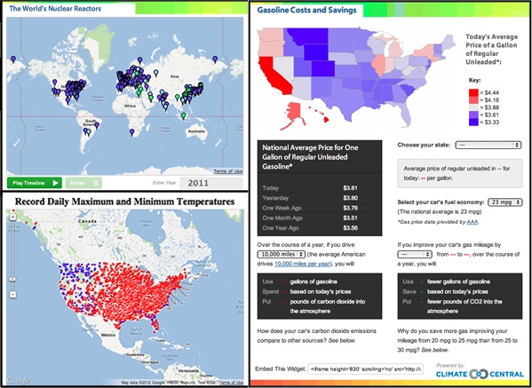
For much of 2011, I worked as a data journalist for Climate Central, where I attempted to tell stories about climate change and energy through both articles and data-driven graphics. For instance, during the Fukushima disaster in 2011, when people wanted to know more about nuclear power, we built this map to show the worldwide distribution of nuclear power. Or when we were experiencing record heat in July, we created this U.S. map. Another graphic and accompanying interactive fuel calculator shows gas prices around the country, and how much you could save by increasing the fuel efficiency of your vehicle. As we quickly learned, many web-surfers would rather point and click than read; such interactives were often our most popular content.

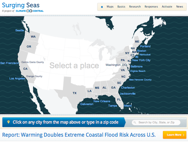
Climate Central has continued to embrace data journalism, and with great results. They recently created these detailed maps of sea level rise, which have been picked up by almost every major media organization and have flooded their website with traffic  (and, not to mention, informed a lot of people about how sea level rise will affect their community).

I learned two important lessons working as a data journalist. The first is that all the tools you need to represent data are readily available online. I had no knowledge of javascript before I started at Climate Central – I just kept searching online how to make the graphics, and found tips from other coders. (Here’s a tutorial showing non-coders how to make a Google map). Want to make a chart? You can use this chart wizard from Google to create an image (which is what I used for the gas price widget above). Or if you know a bit of javascript, or feel ready to learn some, you can use this Google site to make more interactive charts. Other free tools, such as Google Fusion Tables or IBM’s ManyEyes offer ways for you to piece together a graphic without any prior training. There are also useful sites such as flowingdata.com that regularly share how to make advanced graphics.

The second lesson I learned is that while it is relatively easy to put data into a chart or onto a map, it’s much harder to tell a compelling story. You have to analyze the data and show the interesting bits. For instance, consider this graphic by the New York Times, showing Netflix rental preferences by zip code for major cities. The graphic shows an enormous amount of data, and it is tricky to know what you should look at. To help the reader, The Times added two links above the map, telling you which rental picks show the most interesting trends. The authors didn’t just put the data on the map – they looked for the interesting patterns and guided the reader to them. And while I’m proud of my above map of nuclear power, it doesn’t do a good job of telling the story that I wanted to tell – namely, that most countries stopped building nuclear power plants in the 1990s. A simpler graph, such as this one built by lswn.it, does a much better job of displaying that fact. It isn’t enough to put the data on a map or into a graphic; you also have to tell a story.

In short, data journalism offers a great opportunity to communicate a vast amount of information in exciting, interactive ways. But while the tools to do so are readily available, you still have to do the hard part – figure out the story, and tell it well.

Posted in "How To" | Leave a comment

A Tour of Pakistan’s Water Dilemna

To help tell the story of Pakistan’s dilema of both too much and too little water, I made this video last week using Google Earth, iShowU HD, and Final Cut Pro. To highlight the countries in Google Earth, I used code from thematicmapping.org. You can download the kml files I used to make this tour here.

Posted in Maps | 1 Comment

The Life of del Fuego

Recently, while biking my Bruce Gordon Rock ‘n’ Road Tour-Ex uphill in San Francisco, my handlebars snapped just below the right break lever. The aluminum had fatigued from the months of my leaning on it and the other abuse — being thrown on its side in the back of pickup trucks in Venezuela, having cargo leaned against it during a boat passage up the Amazon River, and being dropped on the ground many times less-than-gently. I managed to keep my balance (the benefit of biking uphill is that you’re going slowly), and felt a wave of pride: the handlebars were almost the last piece of the bike that has not yet been replaced.

I looked over the bike and counted the parts that had not been replaced:

The frame (but not the fork)
The front and rear hubs (but not the ball bearings)
The rear XT deraileur
The rear axel (but not the front)

There’s something deeply satisfying about wearing out bike components — a pride in knowing that I have deformed and outlived steel and aluminum with only the force of my legs. When I wear out a component, I feel as if I better understand it, and I know exactly how long a rim or tire or bottom bracket can last. I also feel as if the bike component, if it failed through overuse and not neglect, has served its mission.

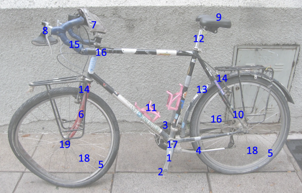
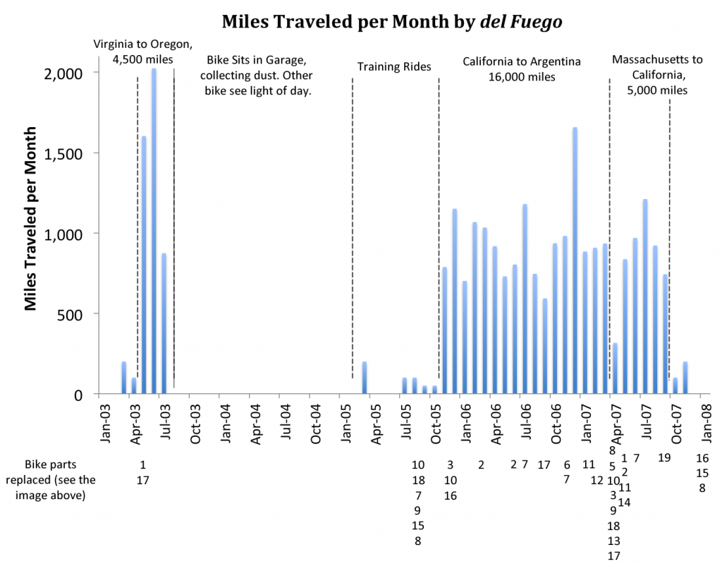
Inspired by my successful wearing-out-of-the-handlebars, I looked over my journals and realized I could map out my journeys with when I had replaced worn out or faulty parts. I then made the following graph, showing how many miles per month my bike traveled (pedaled, of course, by me) and when each component was replaced.

I quickly realized that many of the times I replaced components wasn’t because the part wore out, but rather because I used it incorrectly, or I decided I wanted new parts to improve comfort, or because, well, the bike was run over by a truck. But that is also the fate of a bike that is used out — it will be subject to mishaps and misuse, just as the rider is.

I plan on writing more about the actual events of when parts were replaced and why, but for now, here is the image (taken of my bike after I reached Tierra del Fuego — and after a truck ran it over) and the graph.

Posted in biking | 1 Comment

Brilliant Info-graphic on Money

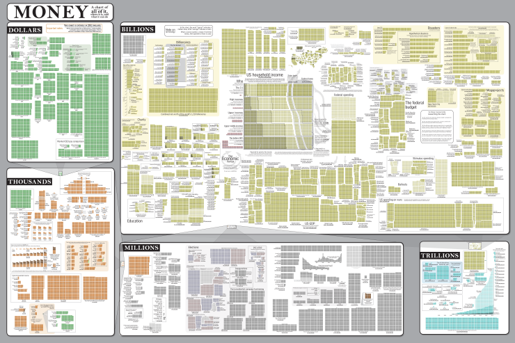
The comic xkcd has just produced another brilliant info-graphic. Click on the image below to compare the costs / incomes / profits / GDPs of things, people, corporations, and countries.

You can buy a poster of this image here.

Posted in from the web | Leave a comment

Happy Halloween


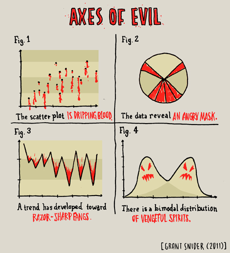
Source: Grant Snider

Posted in Fun | Leave a comment

Science Writers 2011 Attendees

This past weekend, I attended the Science Writers 2011 annual meeting, which was held in Flagstaff, Arizona this year. I led the do-it-yourself data visualization workshop, where I showed people how to make a google map with markers displaying where everyone at the conference lives. The previous post describes how to make this interactive.

The map is below. Of 333 attendees, 120 people have attended three or more before this year, and 113 are first timers. Because most writers are concentrated in cities, thus making the markers overlap (zoom in to San Francisco or New York), the map makes it look like we’re more spread out across the country than we actually are. Although 38 states are represented, over two thirds of the attendees are from just nine states/districts: California (63), Arizona (35), Maryland (23), New York (21), DC (19) North Carolina (17), Colorado (15), Massachusetts (15), and Pennsylvania (14).

Veterans are slightly more likely to come from the Northeast than new members — which would make some sense. Because media is concentrated in the Northeast, I’d expect more writers to be from there. But new-timers, who are probably less convinced he or she should attend, are probably more likely to attend if the conference is closer to home.

I talked to an “old timer,” a former colleague who has been to about 10 of these annual meetings. I asked if the meeting had changed much in his time. He said “no.” I prodded more, and he remarked that the average age keeps on getting younger in comparison to his own age. He added that when it is held in the Northeast, there are far more attendees, and the majority are (unsurprisingly) from that region. In fact, last year, when the conference was in New Haven, there were more than twice as many attendees.

After this conversation, I wanted to know if states were over or underrepresented, compared to their population. So I downloaded each state’s population from Wikipedia, and compared each state’s percentage of the U.S. population to the percentage of Science Writers 2011 attendees from that state. The result (made from Google Charts and copying code from this graphic), is below.

Unsurprisingly, Arizona is the most overrepresented state. The western states and the Northeast are also well represented, and most other states, minus a few outliers, are “missing science writers” at this conference (roll the mouse over each state).

I’d like to see how the distribution of science writers changes with time, and why. Another board member told me that although total membership in NASW was holding steady, there are now far more freelancers and public information officers, and fewer representatives of news-printing organizations. What does that mean for the distribution of science writers in the country? Does the increased “freedom” of freelancing allow people to spread out across the country, or do they decide to cluster in cities in California and New York?

Of course, I can’t answer those questions with this data — I can only tell who decided to attend this one conference. I’d have to dig through the NASW history and do more actual reporting. But it would be interesting to compare this map to other years. I guess I’ll just have to go to #sciwri12 next year, in North Carolina.

Posted in Maps | Leave a comment