

On Lindsey’s and my recent journey across Asia, I was sure to record every day on our Garmin GPS. This not only helped me get a few “King of the Mountains” on Strava, but more importantly, it allowed us to build a detailed map of our route.
Using a Python library that parses Garmin .fit files, I was able to extract the information from each day’s ride and then plot it on an interactive map using OpenLayers. I then built an elevation profile using d3. Click on the image below to explore! You can access blog posts about any part of the trip by clicking on the yellow markers. I also added overlays of population density, water stress (taken from WRI’s Aqueduct), and the location of power plants in China — just click on the links above the map on the right.
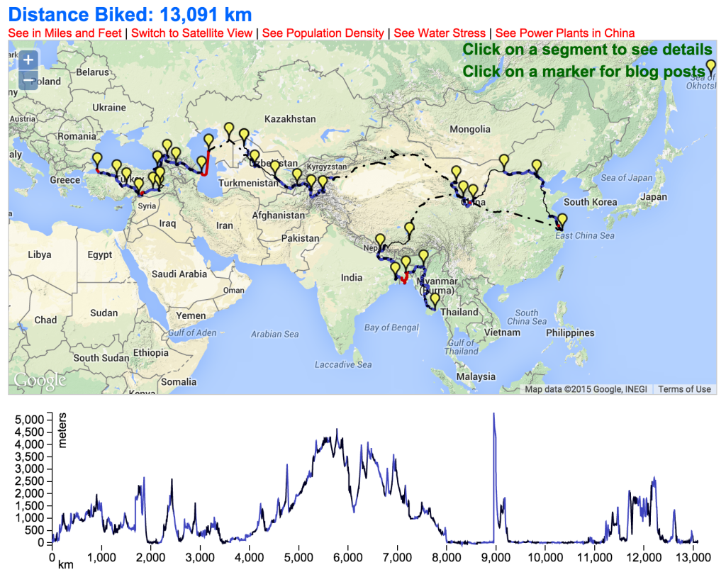
There are a few things I’d like to improve with this map. For one, it includes a lot of data points — about one per kilometer, which is more than 13,000. As a result, the map runs slowly on most people’s computers. It would be nice if I could show a lower-resolution version of our route when zoomed out, and then dynamically show higher resolution as you zoom in. Secondly, the elevation profile is a bit unintuitive — I show the profile for the sections that we biked, not the parts that we bussed, trained, or hitchhiked. As a result, when we took a train to Tibet and then started biking, it looks like we went straight uphill 16,000 feet. Needless to say, we didn’t do that.