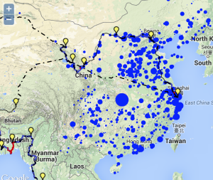
When traveling across China by bicycle, I was amazed by how we seemed to pass a new power plant almost every day. I found myself wanting a map of where the power plants were in the country. Are they everywhere, or only where we were riding?
I found an online database of power plants from Carma.org. While on a train ride in western China, I wrote a Python script to download the entire database and then make a map of where the power plants were located — and I scaled them both by the amount of carbon and electricity they produced. Go to the interactive map of our trip and click on the link “See Power Plants in China.” One reason we passed a lot of power plants is that we followed the Yellow River, and power plants are often located along rivers. Another reason we passed so many power plants is that there are a lot of power plants in China.
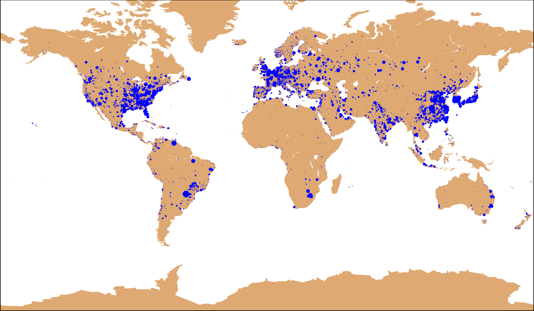
The Carma datset is global, so I also made a map of the entire world. The following two maps show the Carma dataset. The first map (blue markers) shows power plants scaled by the amount of electricity they produce. The second map shows power plants scaled by their carbon emissions. A few things jump out at me from these maps. The biggest difference between the two maps is in hydro-power plants in the world. South America has a number of hydropower plants that produce very large amounts of electricity (and thus are big blue dots), but almost no carbon (and thus are absent from the carbon emissions map). It is also amazing how much of the world produces very little energy.